
In this article
Integration analytics for SaaS is the practice of measuring how customers discover, adopt, and keep using the integrations inside your product, then tying that behavior back to activation, retention, and revenue. Most teams ship a connector and stop looking. The result is a catalog of integrations where a handful carry all the value and the rest sit unused, without anyone knowing which is which.
That gap is expensive. Integrations are one of the strongest stickiness signals in SaaS, yet they are one of the least instrumented parts of the product. If you can tell exactly how many trials return on day 7, but you cannot tell which integration a paying account connected first, you are flying blind on the feature most likely to keep that account.
This guide covers the eight integration metrics worth tracking, why each one matters to the business, and what signal to watch for. It focuses on integration analytics as a growth and retention lever, not on failure alerting. Uptime and error monitoring belong to a separate discipline, covered in our guide on reducing integration maintenance costs.
Key takeaways
Key takeaways:
- Integration analytics connects connector usage to business outcomes: activation, retention, expansion revenue, and churn risk.
- Time to first integration is a leading indicator. Amplitude's 2025 benchmark found that more than 98% of new users churn within two weeks when they never hit a value milestone, and a connected integration is often that milestone.
- Adoption is uneven by design. Only 6.4% of features generate 80% of all clicks in the average software product, so per-connector data tells you where to invest and what to retire.
- Active integrations correlate with retention: according to Albato, users with 5+ active integrations show 36% higher retention, and accounts with 11+ native integrations show 30% higher willingness to pay.
- Integration health as a business signal (silent drop-offs, declining sync volume) predicts churn earlier than a support ticket does.
What integration analytics means for SaaS
Integration analytics is the measurement layer that answers one question: are the integrations in your product actually creating value, and for whom? It treats each connector as a feature with its own adoption funnel, its own retention curve, and its own revenue contribution, rather than as a checkbox on the marketing site.
The distinction matters because integrations behave differently from other features. A user who connects their CRM is making a durable commitment. They are moving data, building a workflow, and rewiring part of their operations around your product. That commitment is exactly what makes integrations sticky, and it is why measuring integration behavior gives you an earlier, sharper read on account health than most usage metrics.
Product teams already track adoption and retention at the product level. Integration analytics applies the same rigor one level down, to the connectors themselves. For teams running native integrations through an embedded iPaaS, that data usually lives in the platform dashboard rather than in a separate warehouse build.
The 8 integration metrics to track
The metrics below map to the full lifecycle: discovery, first use, ongoing usage, and business impact. Track them per connector, not just in aggregate, because the aggregate hides the exact insight you need.
| Metric | What it measures | Why it matters | Target or signal |
|---|---|---|---|
| Integration adoption rate | Share of eligible accounts that connect a given integration | Shows which connectors earn their place in the catalog | Rising per launch cohort |
| Time to first integration | Days from signup to first connected integration | Leading indicator of activation and early retention | Shorter is better, watch the first 14 days |
| Active integration ratio | Accounts with at least one integration that synced in the last 30 days | Separates connected from actively used | Higher share of monthly-active connectors |
| Integrations per account | Average number of active integrations per paying account | Tracks depth of product entrenchment | Growth over the account lifetime |
| Usage or sync volume | Records, events, or tasks moved per integration | Reveals which connectors carry real workload | Concentration in a few connectors is normal |
| Retention by integration status | Retention of accounts with active integrations vs without | Quantifies integration stickiness | Connected accounts retain measurably better |
| Revenue attribution | Expansion and renewal tied to active integrations | Justifies integration investment to the business | Positive lift on expansion and renewal |
| Integration health as a signal | Silent drop-offs, sync failures, declining volume | Early churn warning before a ticket is filed | Any sustained decline flags an at-risk account |
Read the eight metrics as one sequence rather than a flat list. The funnel below shows how discovery feeds first use, first use feeds ongoing usage, and ongoing usage feeds business impact, which is the mental model the rest of this guide follows.
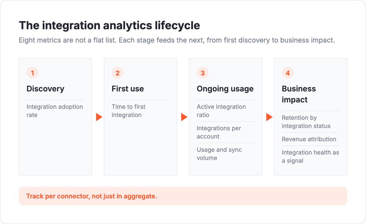
Each of these earns a closer look, because the number alone is not the insight. What you do with it is.
Integration adoption rate
Integration adoption rate is the share of eligible accounts that connect a given integration, calculated as connected accounts divided by accounts that could plausibly use it. It is the first thing to measure because it tells you whether a connector was worth building.
Adoption is uneven by nature. According to Pendo's 2024 product benchmarks, only 6.4% of features generate 80% of all clicks across the average software product, and integrations follow the same pattern. A small set of connectors will do most of the work, while others sit near zero.
That is not a failure, it is a map. Per-connector adoption tells you where to double down (build deeper templates, promote the connector in onboarding) and what to quietly retire. Tracking adoption by launch cohort also shows whether newer integrations land faster than older ones, which is a direct read on how well your discovery and onboarding flow surfaces them.
Time to first integration
Time to first integration measures the days between signup and the moment an account connects its first integration. It is the single most useful leading indicator in this list, because it sits right on the activation path.
The early window is decisive. Amplitude's 2025 Product Benchmark Report, built on data from more than 2,600 companies, found that over 98% of new users churn within two weeks when they never hit a real value milestone in that window. For many SaaS products, connecting an integration is that milestone: it is the moment the product plugs into the customer's real workflow.
The same report found that 69% of top day-7 performers were also top three-month performers, which means early activation predicts long-term retention. If new accounts take too long to connect their first integration, you are watching future churn form in real time. Shortening that path (fewer setup steps, pre-built templates, in-product prompts) moves the metric that everything downstream depends on.
Active integration ratio and integrations per account
Connecting an integration and using it are two different states, and integration analytics has to separate them. The active integration ratio measures the share of accounts with at least one integration that actually synced in the last 30 days. Integrations per account measures how many active integrations a paying account runs on average.
Together they describe depth of entrenchment. A single active integration makes a product harder to leave. Several active integrations make it a system of record, and that is where switching costs get real.
Albato's platform data reflects this pattern across its customer base:
- Users with 5+ active integrations show 36% higher retention
- Accounts with 11+ native integrations show 30% higher willingness to pay
The two figures below pair each depth threshold with the business outcome it drives, so the correlation between more active integrations and better results is easy to read.
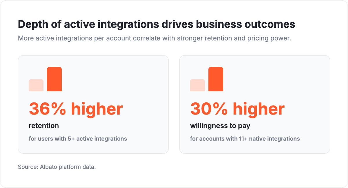
Those numbers give the depth metrics a clear job. Watch integrations per account climb over an account's lifetime, and watch the active ratio stay high. When either flattens or drops, expansion has stalled and renewal risk is rising. This connects directly to how integrations shape engagement over time, which we cover in how embedded integrations boost retention.
Usage and sync volume
Usage volume measures the actual work an integration does: records synced, events processed, or tasks run over a given period. Adoption tells you a connector was turned on. Volume tells you whether it is doing anything meaningful.
The two often disagree. A connector can show healthy adoption yet move almost no data, which usually means users set it up and forgot it, or it solves a problem that rarely comes up. A connector with modest adoption but heavy volume is quietly load-bearing, and it deserves reliability investment and a prominent place in onboarding.
Expect concentration. A few connectors will carry most of the volume, mirroring the adoption skew. That concentration is worth mapping deliberately, because it tells you which integrations you cannot afford to let break. To keep those high-volume connectors healthy without a growing maintenance bill, the operational side lives in our guide on reducing integration maintenance costs.
Retention and revenue: The metrics that reach the board
The four metrics above describe behavior. The next two translate behavior into money, and they are the ones a CFO or board actually asks about.
Retention by integration status compares how well accounts with active integrations retain against accounts with none. When you segment retention this way, the integration effect usually shows up clearly, and it gives you a defensible case for investing in the integration roadmap. Albato's case studies show the size of the effect: RD Station reported a 73% retention lift after adding native integrations, and JivoChat reported a 20% LTV increase.
Revenue attribution ties active integrations to expansion and renewal. The goal is not perfect causal proof, it is a consistent read on whether integrated accounts expand and renew at higher rates than non-integrated ones. If they do, the integration roadmap is a revenue driver, and it should be funded like one. If integration and revenue never move together in your data, that is a finding worth acting on too.
These two metrics are what turn integration analytics from a product-team curiosity into a business conversation. They belong in the same review as MRR and churn, alongside the rest of your core SaaS metrics.
If you want to see how per-connector retention and revenue data surfaces without a warehouse build, a short walkthrough of the embedded dashboard is the fastest way to judge the fit.
Integration health as a business signal, not just an uptime check
Integration health usually gets framed as an engineering concern: is the connector up, are calls succeeding, are we inside rate limits. That view matters, but it misses a business signal hiding in the same data.
A silent drop-off tells a story. When an account's sync volume declines for weeks, or an integration that ran daily goes quiet, that is often the first observable sign of churn, and it shows up well before a support ticket or a cancellation. Watching integration health as a customer-success signal lets you reach the account while there is still time to intervene.
The line between this and maintenance monitoring is worth drawing clearly. Auth token expiry, schema changes, and rate-limit handling are operational reliability problems, and they belong in a maintenance workflow. Integration health as covered here is the business read on that same telemetry: not "is the connector broken" but "is this account pulling away." Both use integration data. They answer different questions.
The split below shows both disciplines drawing from one shared telemetry source while answering different questions, which is the distinction this section turns on.
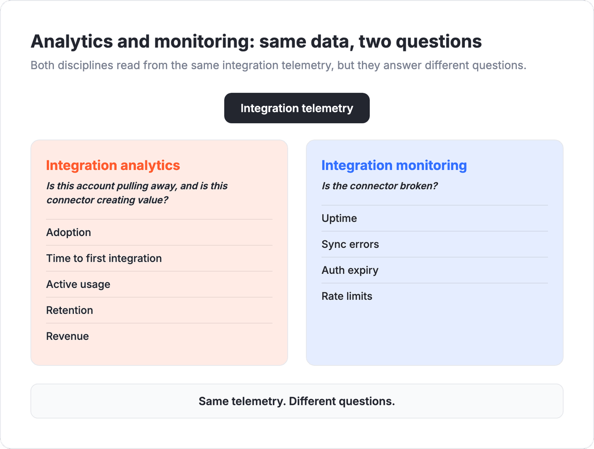
Keeping the two straight is what lets a single stream of integration data serve both engineering and customer success without either team misreading it.
How to instrument integration analytics without a warehouse project
You do not need a custom data pipeline to start. Most of these metrics are available directly from the integration layer, and the practical approach is to make them visible where the team already works.
A workable sequence looks like this:
- Start with time to first integration and adoption rate per connector, since they need the least tooling and drive the most decisions.
- Add the active ratio and integrations per account once you can distinguish connected from actively syncing.
- Layer in retention and revenue attribution by segmenting accounts you already track by integration status.
- Set up integration-health alerts as a customer-success trigger, not only an engineering one.
This is also where the delivery model matters. Teams that build integrations in-house often have to instrument each connector separately, which is why integration analytics tends to get skipped. Platforms like Albato Embedded, which lets SaaS companies add 1,000+ native integrations without building them from scratch, surface per-connector usage in a built-in dashboard, so the adoption, active-ratio, and volume data is there from day one rather than being a follow-on project. TimelinesAI, for example, shipped a full library of native integrations in weeks and could see usage across them from the start.
Frequently asked questions
What is integration analytics for SaaS?
Integration analytics is the practice of measuring how customers adopt and use the integrations inside a SaaS product, then connecting that behavior to activation, retention, and revenue. It treats each connector as a feature with its own funnel rather than as a static catalog entry.
Which integration metrics matter most?
Time to first integration and integration adoption rate are the strongest leading indicators, because they sit on the activation path. Retention by integration status and revenue attribution are the metrics that prove business impact and belong in a board review.
How is integration analytics different from integration monitoring?
Integration monitoring watches reliability: uptime, sync errors, auth expiry, and rate limits. Integration analytics watches value and behavior: who adopts a connector, how much they use it, and whether that usage drives retention and revenue. They share telemetry but answer different questions.
How many active integrations should an account have?
There is no universal target, but depth correlates with stickiness. According to Albato, users with 5+ active integrations show 36% higher retention, so watching integrations per account grow over the customer lifetime is a useful signal.
Turning integration data into decisions
Integration analytics is not a dashboard you check once a quarter. It is a continuous read on the feature most likely to keep your customers, tracked per connector so the signal is actually usable. The teams that measure it can tell which integrations to promote, which to retire, which accounts are pulling away, and whether the integration roadmap is paying for itself.
The starting point is visibility. If you can already tell how many trials return on day 7 but cannot tell which integration a paying account connected first, the fix is to make integration behavior as measurable as the rest of your product. That means tracking adoption, time to first integration, active usage, and the retention and revenue those integrations drive.
Albato Embedded lets SaaS teams add 1,000+ native integrations without building them, and its dashboard surfaces per-connector usage so the analytics come with the connectors. Teams at TimelinesAI and RD Station shipped native integration libraries in weeks and could measure adoption and usage from day one, rather than treating instrumentation as a separate project.
If you want to go deeper, the pieces below build on this guide: the core SaaS metrics to track, how embedded integrations lift retention, and the operational side of keeping connectors healthy.